
|
Viewout
|
|


While I’m personally probably too young to have experienced the ‘golden age’ of bookmarks myself, there are situations everyday in which I’d like to bookmark something, proving that this feature definitely still has it’s place. I already tried to get into bookmarks several times, but an unintuitive and frustrating user experience has always pushed me back. Most bookmark implementations just feel out of place in today’s modern browsers. That I was not the only one having problems with the current state of bookmarks, and that Google was apparently aiming to change this got also me excited.
The initial leak of Google Stars happened last year in June, and since then, much has happened. In November, the service saw a first, rather unspectacular release to Chrome’s web store, before becoming a native part of Chrome one month later, with the beta version of Chrome 40. However, nearly 6 months later, Google Stars still hasn’t found it’s way outside of beta yet. The Chrome extension has just recently been pulled from the web store, and without any official word from Google on the project since November, the future of Stars appears to be rather uncertain at the moment.
It seems likely that negative feedback from beta users is the main reason that Google is holding the service back, as especially bookmark veterans continue to complain about a variety of things that Google Stars disimproves for no apparent reason.
I myself, as one who was already unhappy with it’s predecessor, found the service to also still have much more fundamental problems in the few months I’ve now been using it. Expectations might have admittedly been way too high, but the service is just not the revolution I had hoped for. It is simply not capable to reinvent or to revive bookmarks. In fact, it does in my opinion not change anything.
Of course the new interface is indeed really slick and modern (it has even received a full Material Design update by now), but it does also carry the exact same flaws from the previous implementation with it: Apparently, it wasn’t the outdated look holding bookmarks back. And apparently, it also wasn’t the absence of auto-generated folders - which might be really great for some, but is ultimately just a very niche feature -, nor was it the absence of a proper search implementation.
But what did I expect? What might had been able to actually revive bookmarks? Before starting to work on this concept, I tried answering these few simple questions.
What has to be done to make bookmarks ready for the 21st century?
There are many reasons for people to create a bookmark: Having done some research on a topic, to remember an article to read for later while in a hurry, or just to put some content in ones personal archives because it’s really interesting or good or something. One of the biggest problems with browser bookmarks today is that they seem to be not really considered for those everyday scenarios: A user does most likely not want to choose a nice thumbnail, title and description for a bookmark while in hurry, and it also makes no sense to prompt a user to complicatedly organize a dozen of new bookmarks after a long, exhausting marathon of doing research.
Another big problem is that having created a new bookmark, more often than not it will be forgotten by the average user afterwards, collecting dust until the bookmark manager might be opened again once upon a moon. And until then, chances are well that a link is already obsolete, or that a user will have bookmarked so much stuff that the manager is not only totally cluttered, but it’s very unlikely that all those bookmarks are ever going to be properly organized.
With these key problems in mind, this concept aims to actually make bookmarks appealing again. Instead of focusing on the bookmark manager itself, however, as Google has done with Google Stars, the favorites bar is the most important part of this concept. Before this, however, there are two more minor changes to be made to pave the way for a modern bookmarking experience in general and also to make the new favorites bar excel best.
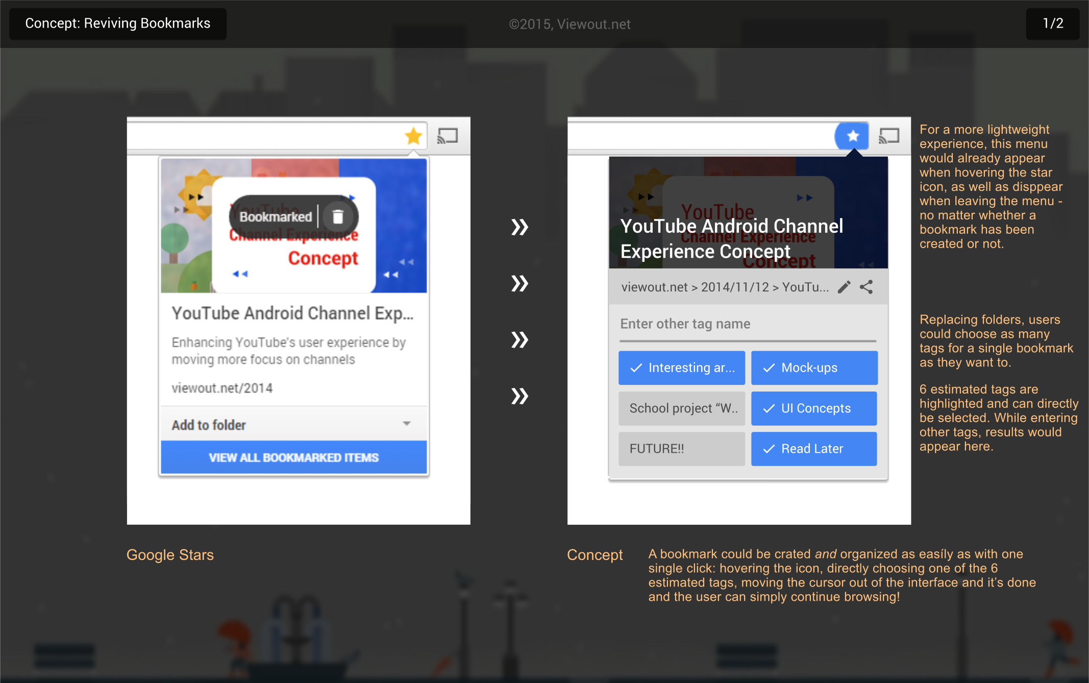
1) First, instead of folders, bookmarks should be organized more efficiently with tags. Those would be basically identical, except that a single bookmark could have several tags at once. This would not only finally mean the end for the outdated differentiation between desktop and mobile bookmarks, but it would also open for much deeper and more personal ways to organize your bookmarks.
As shown in the concept pictures, an important part of the new experience is that besides manually choosing a tag, users can also quickly choose out of 6 estimated tags when creating a new bookmark, which are based on the site’s content and on recently used bookmarks.
2) Secondly, the user experience should become more lightweight, with especially the process of creating a bookmark becoming faster and less obstructive. For this purpose, the card that currently appears when a bookmark has been created should already appear when the user just hovers the star icon in the URL bar (as well as disappear when moving the cursor out of it, no matter whether a bookmark has been created or not).
Bookmarks could be created either by traditionally clicking on this icon, or, which seems like a more comfort and easier way, by directly choosing at least one of the previously mentioned six estimated tags. A bookmark could thus be created and organized as easily as with one single click, and the user could then also simply continue browsing, without the need to click somewhere else on the page first to close this interface or similar hurdles.
Also, more lightweight means that interface elements should feel and act more like web pages: right-clicking should open the usual context menu, clicking on the mouse wheel should open a link in a new tab, and also dragging content should work as usual. Chrome used to focus more on this aspect (e.g. taking a look at Chrome’s settings or history), but it went totally missing with Google Stars. The big advantage here is in first place that it feels less bulky and that users intuitively know the basic rules of any interface.

With these two minor changes in mind, let’s continue to the most important part of this concept, aiming to actually break the previously detected real problems of bookmarks: that they’re too often and easily forgotten, and that users do often not want to directly organize a new bookmark when creating it.
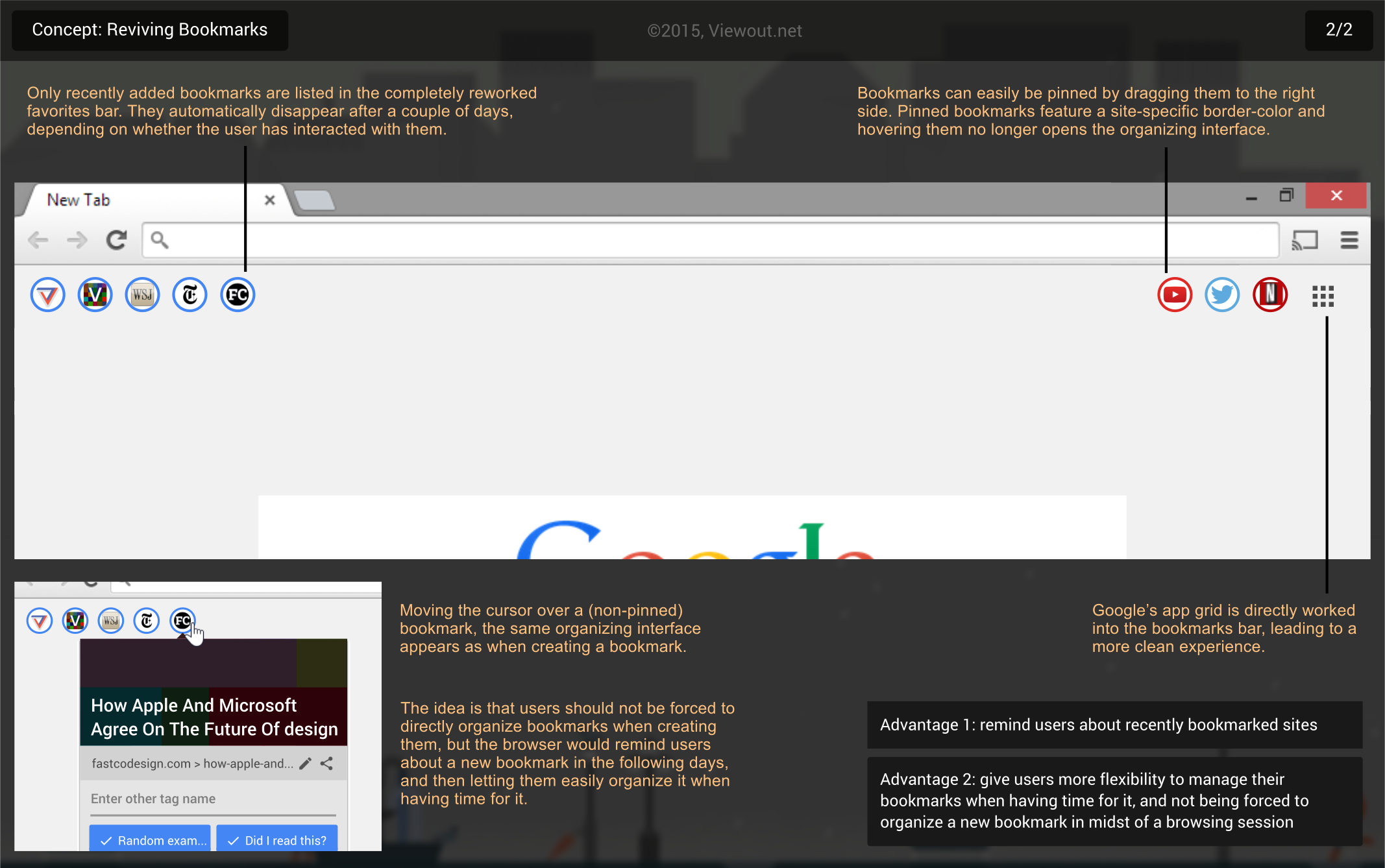
As already hinted, key for solving those problems would be a completely rethought bookmarks bar, which should serve as a more direct wire to the user: Instead of blatantly listing the entire bookmark library, only newly created bookmarks would appear in the new bar. Those would be aligned to the left and slimmed down to each just consisting of the respective site’s favicon.
This new bar would have two primary advantages: on the one hand side, it would remind users about recently created bookmarks in a very quick and subtle way. Imagine bookmarking something to read for later late at night on your phone, and the next day you see it again and are reminded about it when powering up your PC. Of course it’s also easy to ignore the little favicon in the top left of every new tab page a couple of times, but, without it being any annoying or aggressive, you’re surely getting to notice it in the course of the following days.
The second advantage of the reworked bar would be more flexibility in the process of organizing new bookmarks: The card that appears when creating a bookmark would also appear when hovering the different favicons in the new bookmarks bar, highlighting a fast and simple way to organize new bookmarks whenever having time for it, and thus being no longer forced to directly organize a bookmark when creating it (or otherwise forgetting about it). Imagine for example bookmarking a couple of interesting articles while in a hurry, and again at a different time when powering up Chrome or whenever having some free time, you would recognize these articles in the bar and could then start organizing. It would become very easy to shift the process of managing a new bookmark to later, more suited times.
Of course bookmarks could still be organized when creating them, but it would be less of a struggle when not doing so, as well as it would also disturb the browsing experience much less.
The number of bookmarks that the new bar would include, as well as the amount of time that a bookmark stays in the bar would heavily depend on many different factors, e.g. how many bookmarks an user usually takes, whether he has interacted with a new bookmark (e.g. having organized or opened it), how often it has been seen and maybe even based on the topic or tag how likely it is that the user is going to interact with it later on or not. A bookmark with which the user has already heavily interacted with might fade away a couple of days earlier, whereas a bookmark that has only barely been loaded might stay in the bar for a few additional days.
Further more, bookmarks could also be pinned, making them not go away at all. Pinned bookmarks are aligned to the right and feature site-specific border colors and they also don’t trigger the bookmark-managing interface when hovering them. A normal bookmark could easily be pinned just by dragging it to the right side.
Also, Google’s very own services would be implemented in a much nicer and more natural way as part of the reworked favorites bar, with only the app grid being left, aligned to the very left.
Lastly, there could also be a way to select several new bookmarks at once by dragging a selection field, and then organize them simultaneously (though this is more of a coarse idea than a complete part of this concept).
To sum things up, the reworked bookmarks bar would basically have two main advantages leading to a more intuitive experience: it would remind the user about new bookmarks, and it would make it easier to organize bookmarks when having time for it and not in midst of a browsing session where one is more likely solely interested in creating a bookmark and then continue to browse.
Using Google Stars, I myself once again got very aware how seldomly you actually only come across the manager interface itself. The new favorites bar would lead to more regular engagement with new bookmarks, and when a user one day actually wants to browse his bookmarks, he’ll find a tidy and organized manager interface. I think it’s the functionality alone that would make this concept work; even with a boring, text-based interface, this would probably still suit today’s browsing habits much better than Google Stars’ fancy look. I’m sure that these changes would be what’s necessary to finally revive browser bookmarks!
What’s your opinion? Were your expectations met by Google Stars? Do you think the new favorites bar would actually be able to move bookmarking forward in such a great way? Are you regularly using browser bookmarks?
Follow Viewout on on Facebook, Twitter and Google+ to stay in touch with new concepts and articles!
